NCTE Brand Guidelines
NCTE Colors
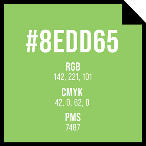
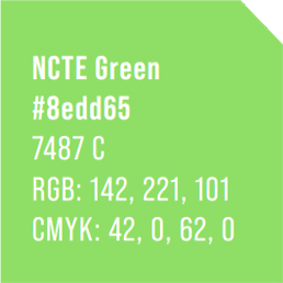
Our primary color is NCTE GREEN.
NCTE Green is bold, fresh, and inviting. This helps our symbol reflect the human spirit, positivity, and inclusion.
Use it for hero statements.
Color bars and blocks.
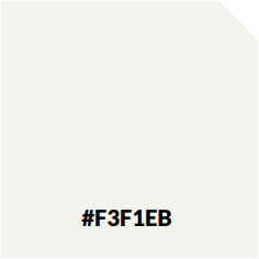
Contrast it with white and black spaces.
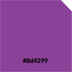
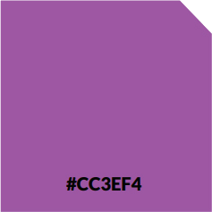
NCTE Bold Palette
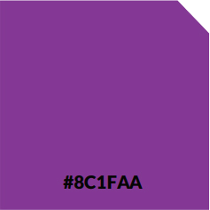
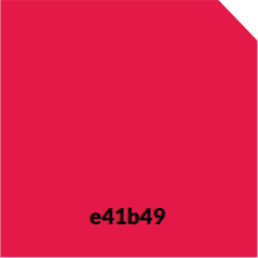
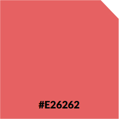
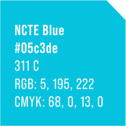
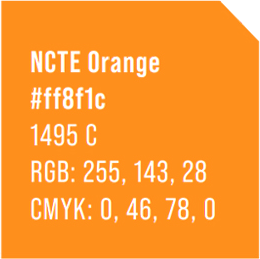
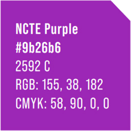
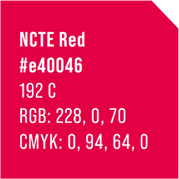
We have created a Bold palette of five colors to allow us to use our symbol and communications in a bold, expressive way and to integrate it with imagery.
This helps our symbol and communications reflect the human spirit and human emotions.
There are five colors in our Bold palette, representing the NCTE brand spectrum.
Depending on your design application, you can use any color from the Bold palette. We use different colors to keep the brand feeling fresh and lively.
Our Bold palette of colors can be used on white, solid color, and image backgrounds.
Careful consideration should be used if using a Bold palette color as the design’s primary mark.
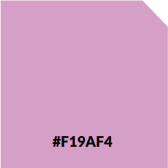
Secondary Color Palette
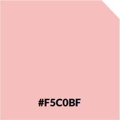
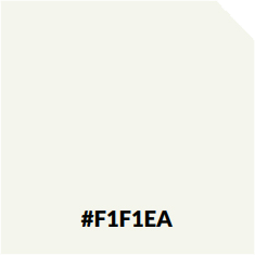
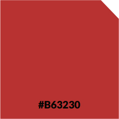
We have also developed a Secondary color palette to support our Bold color palette.
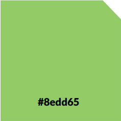
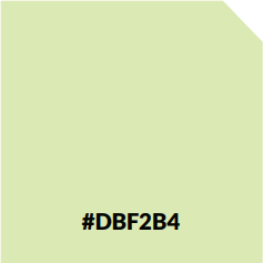

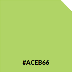
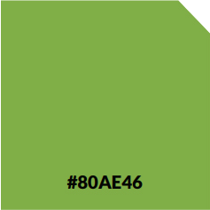
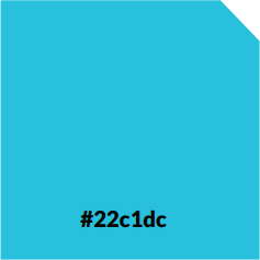
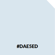
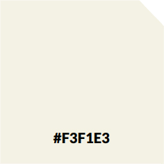
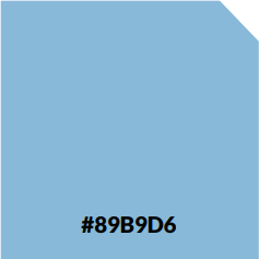
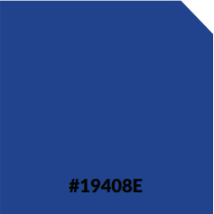
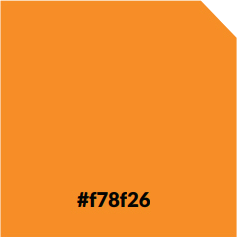
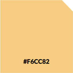
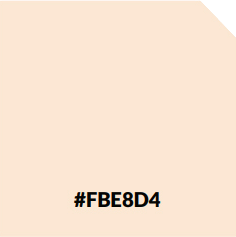
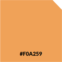
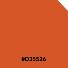
Supportive Color Palette
There are complementary colors for each of the five bold colors.
We use our Secondary palette for the same types of communications as our Bold palette, but we use it much more sparingly—only where subtle differentiation is required.
We should avoid the Secondary palette for general use so we do not dilute the vibrancy which our standard, Bold palette brings to our communications.
