NCTE Brand Guidelines
NCTE Typography
We have two typefaces for use in different situations—these will give our communications distinction and consistency.
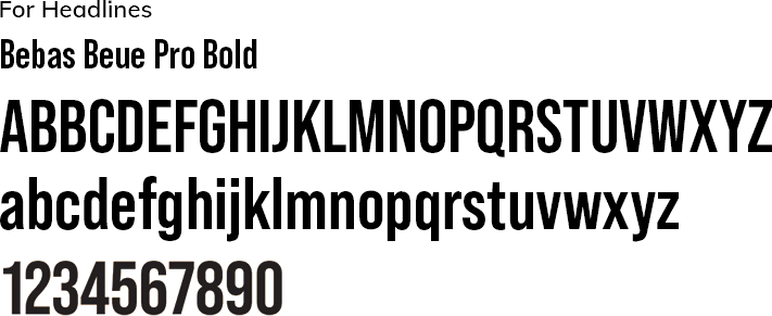
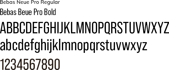
Our Primary Logo font is Bebas Neue Pro. Bebas Neue Pro is an empowering, bold, condensed, geometric font. It gives headlines high impact in small and large spaces.
Bebas Neue Pro can be used for headlines and subheads in all caps or caps and lowercase when a project you’re producing needs a bold impact headline. Note we prefer using Bebas Neue Pro in all caps as a headline.

NCTE Typography Application
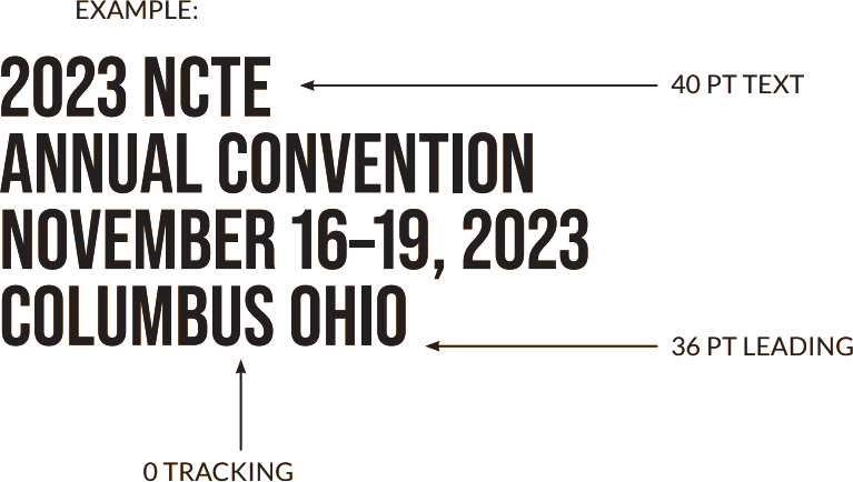
Bebas Neue Pro Bold, uppercase ranged left
Leading for headlines is -10% of the heading point size Example: when the point size of the text is 40pt the leading becomes 40 minus 10% (4pt) which equals 36pt.
Leading for body copy is 20% of the point size. Example: When the point size of the text is 10 pt., the leading becomes 10 plus 20% (2 pt), which equals 12 pt.
The difference between tracking and leading
Tracking considers the placement of all letters in a word, and all comments on a line within a typography project. Tracking looks at horizontal spacing, similar to kerning.
Alternatively, leading looks at vertical space—the distance between words set above or below each other on a page or within a project. Both look at larger pieces of text, such as paragraphs, rather than logos or headlines.
NCTE Secondary Typeface
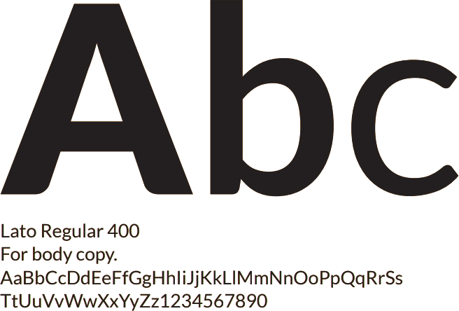
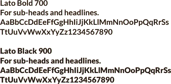
Our secondary typeface is Lato Regular. It complements Bebas Neue Pro; it is ideal for headline, text, detailed information, and where space is limited.
There are three weights of Lato we will use, each with a roman and italic style.
Lato is an open-source font and is available from www.fonts.google.com or www.fonts.adobe.com.
Desktop and Online Typography
Arial
Our default typeface for on-screen viewing and printing from our desktops is Arial. It is widely available, ensuring consistency across all these types of communications.
We do not use Arial for any professionally-produced communications.
